Luxury Candle Packaging Design Trends
A buyer's guide to visual direction, tactile papers and finishing choices that can become a workable packaging specification.
Luxury Candle Gift Set Design
Design Concept Notice
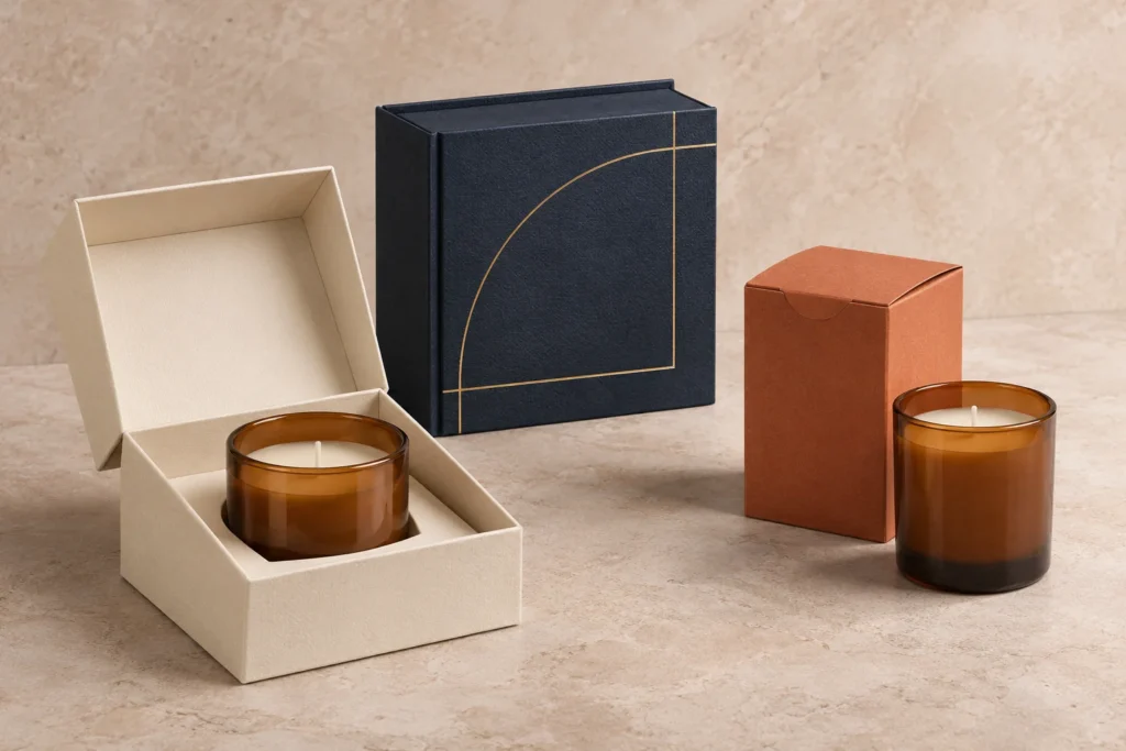
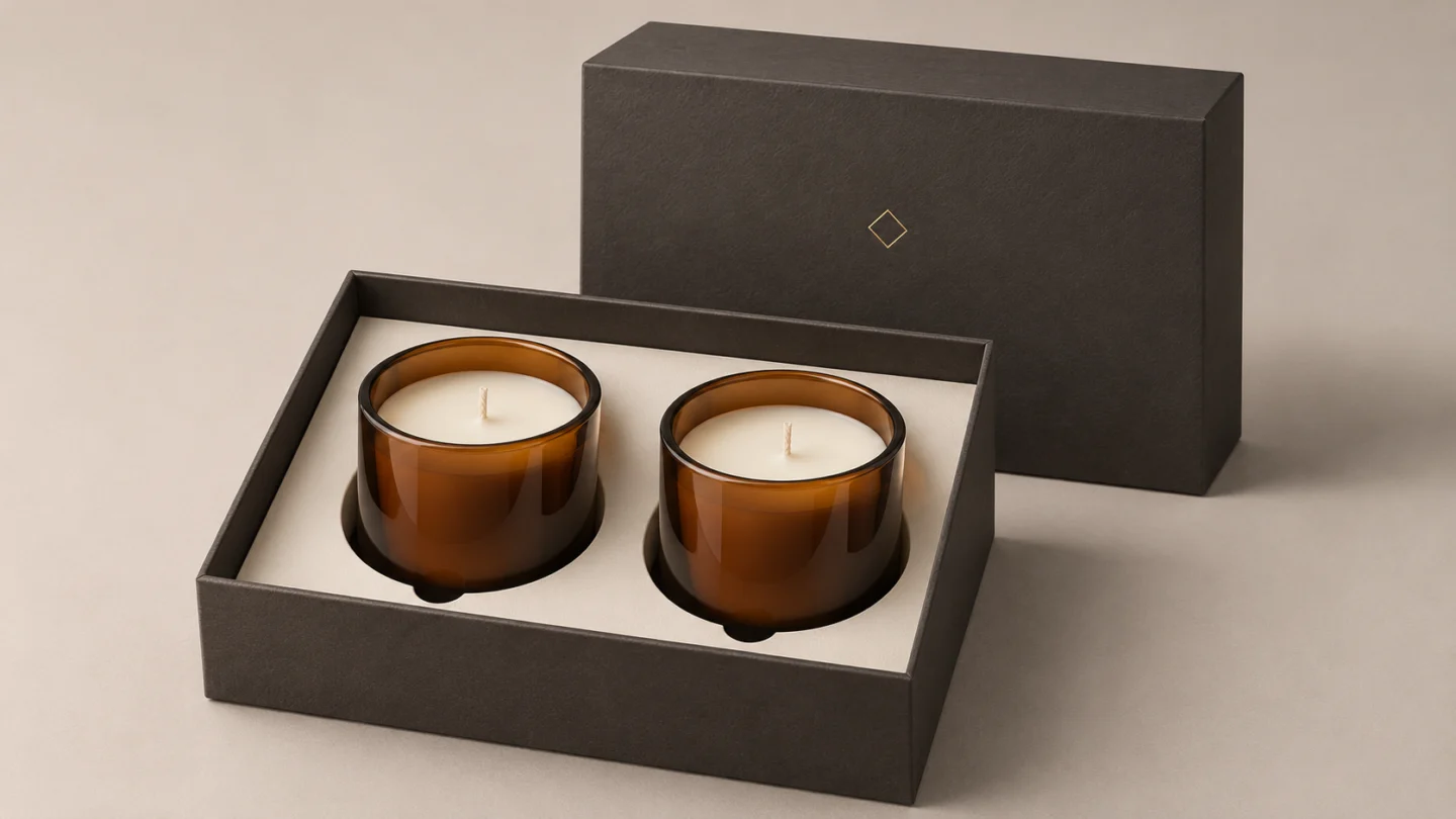
The product visuals in this article are AI-generated design concepts. None are photographs of LUX BOX client projects or approved production samples.
The luxury candle packaging design trends worth considering combine restrained graphics, tactile paper, selective metallic details and a deliberate opening experience. For a premium candle brand, the challenge is choosing a direction that expresses the fragrance range and can be reproduced consistently across orders.
A beautiful mockup is only the starting point. The paper, printed color, finish and box construction need to work together around the finished candle. This guide connects those design choices with the samples and specifications a packaging buyer should review.
Minimalist luxury: make the hierarchy do the work
Minimalism gives a small number of elements more responsibility. Establish the relationship between brand name, fragrance name and supporting information before adding decoration. A modest logo with generous space can be more appropriate than a large emblem competing with every panel.
A consistent cream-and-black palette with a restrained ribbon detail can create recognition across a candle range. Repeating that visual system matters more than assuming one palette suits every brand.
For your own range, test the layout at actual box size. A fragrance name that looks elegant on a large screen may become difficult to read on a narrow carton. Keep essential information legible when the package sits beside other products.
Tactile materials: separate appearance from structure
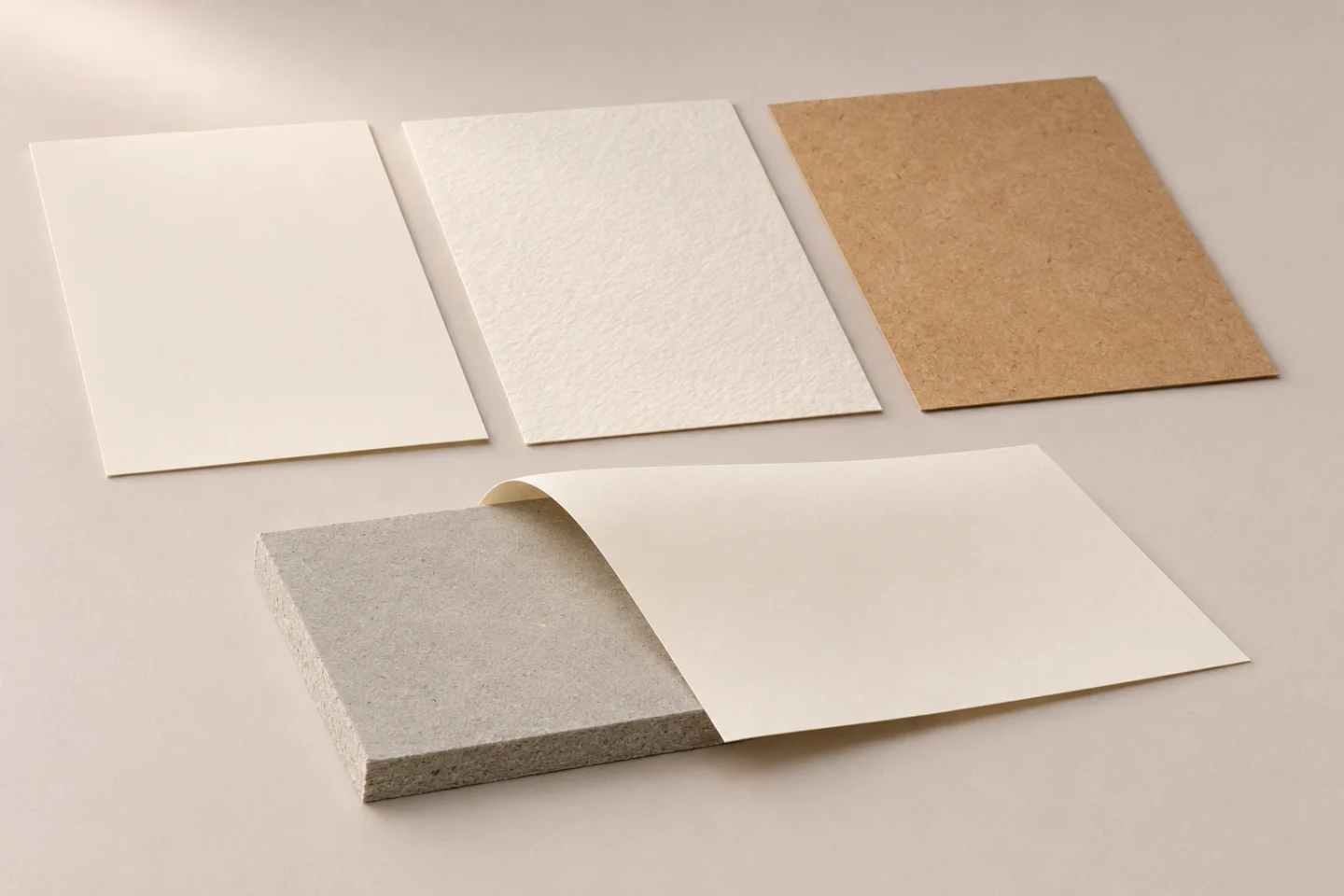
Specialty paper can introduce texture, color or a distinctive surface. Smooth paper supports a different visual character from a pronounced grain. Brown kraft paper can suit a warmer, understated identity, but its appearance alone establishes neither a luxury position nor an environmental benefit.
In a wrapped rigid box, distinguish the structural board from the covering paper. The core contributes to the build; the visible wrap carries much of the printed and tactile expression. Specify both instead of describing the whole package simply as “premium paper.”
Ask for the proposed stock with the actual artwork and finish. Review fine type, folded edges and wrapped corners, where texture and construction meet. For repeat orders, retain an approved material reference alongside the printed sample.
Foil stamping: concentrate the metallic effect
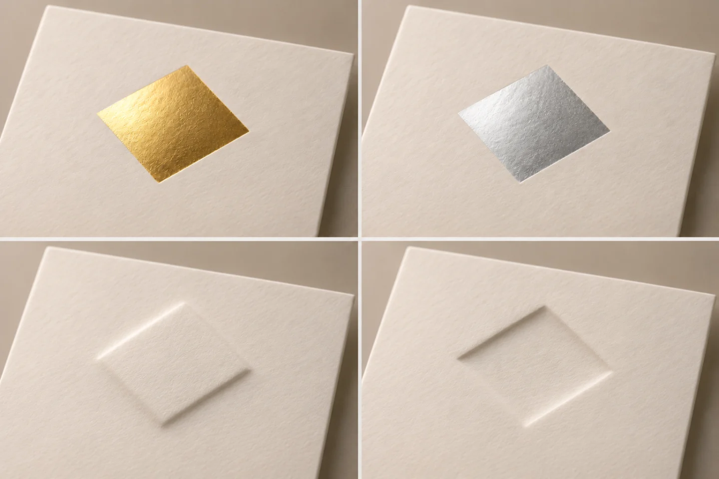
Gold and silver accents can establish contrast without covering every surface. A narrow border, fragrance emblem or selected letterform may give the eye a clearer focus than several competing metallic panels.
Hot foil stamping transfers a foil layer using heat and pressure. A gold-colored printed area is not automatically the same process. When briefing foil stamping, identify the foil appearance, coverage and position rather than relying on a screen color.
Small accents are a design choice, not a technical limit on foil coverage. Check fine lettering, gaps and the edge of solid areas on the selected stock. A textured surface or a tightly spaced logo can change the result; approve a physical impression before committing the full range.
Embossing and debossing: give the logo a physical presence
Embossing raises a design above the surrounding surface; debossing presses it below that surface. Either can introduce relief to a logo, brand name or pattern without adding another printed color.
Keep the treatment selective. A broad, simple mark is a different proposition from tiny lettering with narrow internal spaces. Review the actual paper and proposed construction for detail, legibility and the appearance on the reverse side. Also check the position relative to folds and corners. Adding foil to the same motif introduces another alignment requirement; it should be evaluated as a combination.
Premium surface finishes: choose for handling as well as appearance
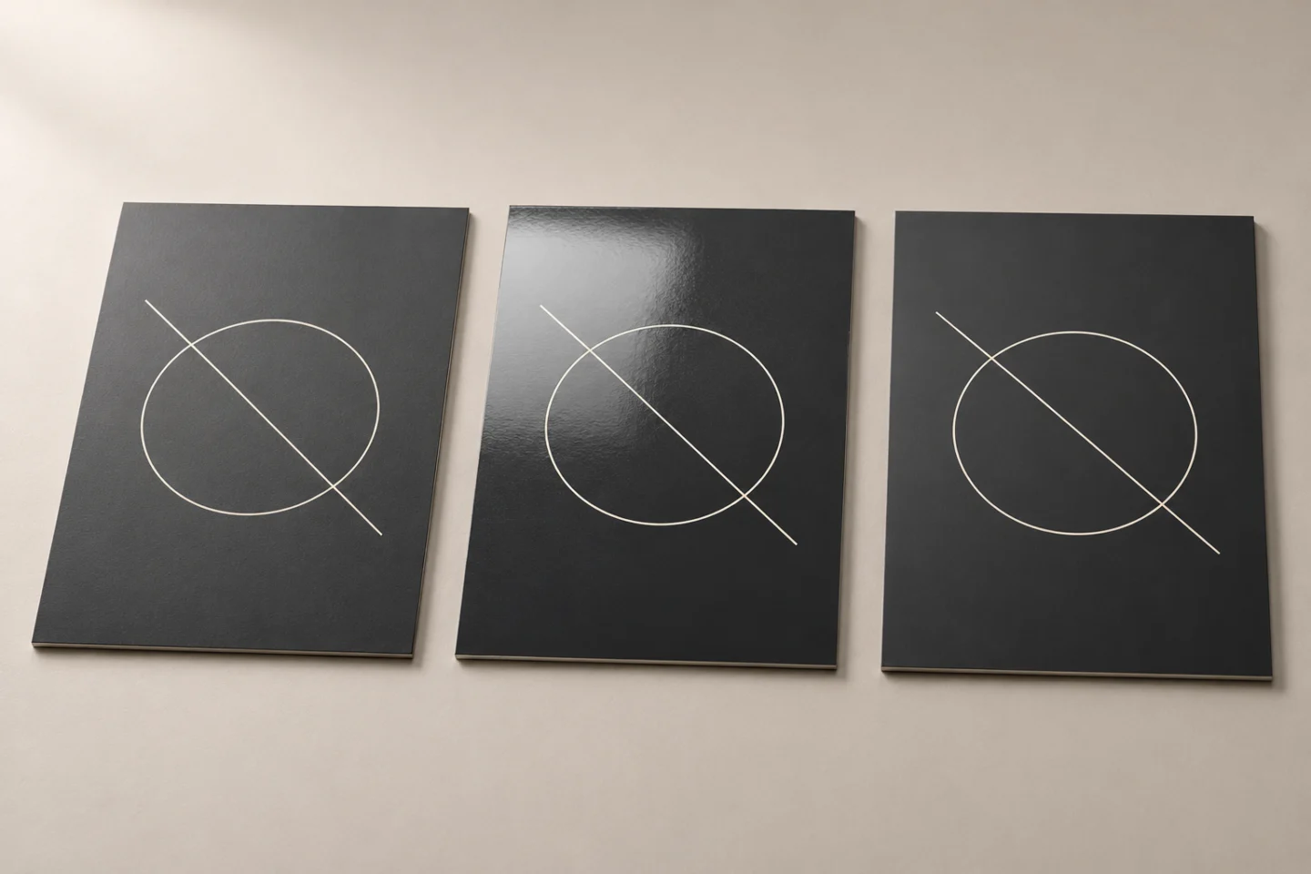
Lamination adds a film to the printed surface. Matte, gloss and soft-touch films offer different visual or tactile effects, but a finish name is not a complete performance specification.
| Finish | Design effect | What to review on a sample |
|---|---|---|
| Matte lamination | Restrained highlights and a quieter surface | Dark-area marks, color appearance and crease behavior |
| Gloss lamination | Reflective sheen for a brighter presentation | Glare over small text, handling marks and folded edges |
| Soft-touch lamination | A velvet-like tactile character | The exact film grade, handling response and compatibility with other decoration |
For high-end candle packaging, ask the supplier to identify the proposed film and processing sequence. Compare the grade with the manufacturer’s information, such as this velvet-lamination range. Do not assume every soft-touch film is scratch-resistant, or that a glossy surface guarantees protection in distribution. Evaluate the completed box after ordinary packing and handling, not only as a flat sheet.
Elegant color: build recognition across the fragrance range
Neutral colors leave room for typography and surface detail. Earthy tones can suggest warmth, while deep navy, green or charcoal can support a more dramatic presentation. Metallic accents can introduce a controlled contrast. These are visual options, not proven rankings of consumer preference.
Aesthetic candle packaging still needs a clear fragrance hierarchy. Decide which elements remain fixed across the range and which identify each scent. Check the same layout in light and dark variants, including the contrast between the box, vessel and label. Approve color on the intended material and finish; an uncoated paper reference and a laminated printed surface are different approval conditions.
Structure and unboxing: make the design easy to use
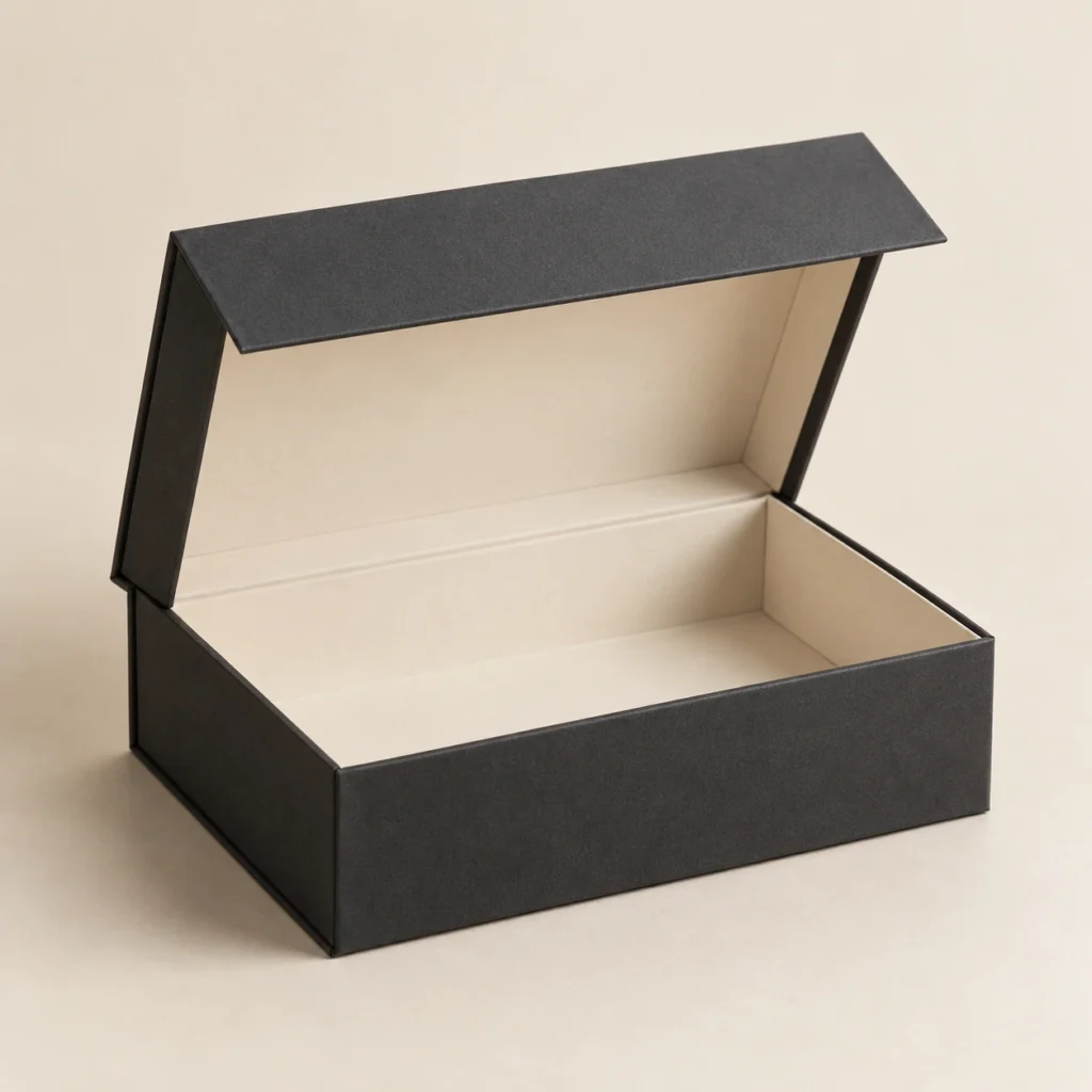
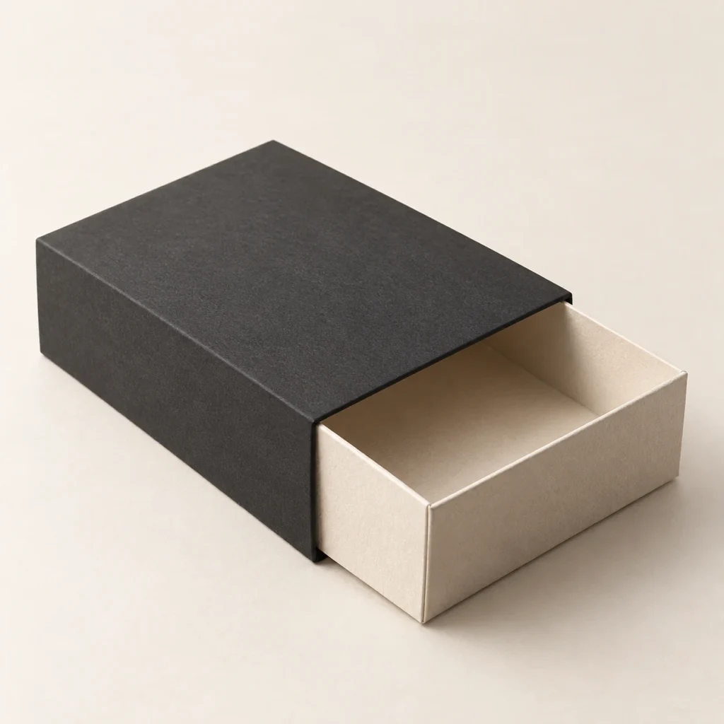
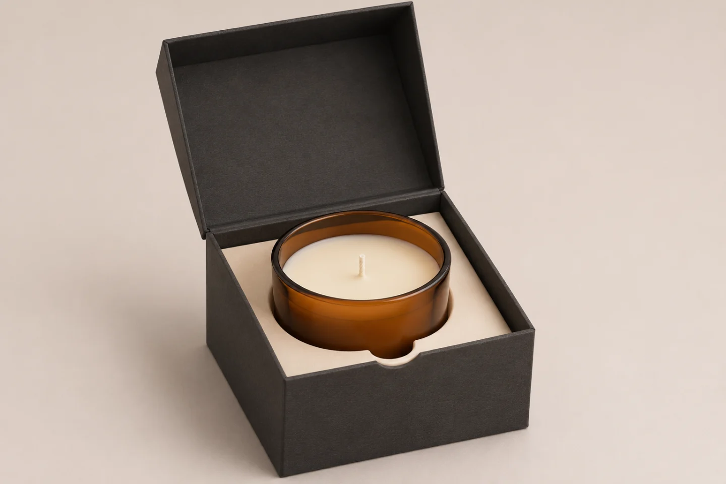
Structure should support the intended experience. A rigid presentation box can frame a gift-led candle; a hinged magnetic box offers an attached-cover opening; a drawer creates a sliding reveal. A folding carton may be the more practical format for a repeat retail line.
An insert positions the vessel and affects what the customer sees first. Review access for removing the jar, clearance around its rim and how staff load the candle. An attractive display does not establish shipping protection: evaluate the complete dispatch pack separately.
For magnetic closure boxes or drawer boxes, sample the opening and product removal with the actual vessel. Keep decorative paper, closures and fitment decisions connected to that physical check.
Sustainable luxury: simplify with the complete pack in view
Start by questioning components that add little to the experience. A coordinated paper structure, considered decoration and a removable insert may offer a simpler approach than several unrelated layers.
Recyclability depends on the whole construction, including coatings, laminates, adhesives, decoration and local collection systems. 4evergreen’s circularity guidance treats material and converting choices as part of that assessment. A brown surface, paper core or reusable-looking box is not sufficient evidence for an environmental claim.
When changing a component, check fit and handling again. Removing material without reviewing the filled candle can create a different packaging problem. Make sustainability statements only when they are supported for the proposed specification and destination.
Choose the right luxury candle packaging design for your brief
The best candle packaging design for your range depends on its price position, sales channel and packing process. A wholesale retail line may benefit from a clear carton design; a flagship gift candle may justify a more elaborate presentation. Compare the complete specification at the same quantity before deciding which route fits the budget.
Give the supplier a brief that includes:
- Brand positioning, fragrance variants and the intended shelf or gifting context.
- Finished vessel dimensions, filled weight and any accessories packed with it.
- Preferred structure, paper references, artwork and one principal decorative effect.
- Estimated order quantity, variant quantities and the target packaging budget.
- The samples needed to approve color, finish, opening, fit and packing.
Confirm the minimum order quantity for the agreed combination. Tooling, material choice, decoration and assembly can change the quotation. Request a physical sample of the full proposed pack before approving production, and record the specification for repeat orders.
Frequently asked questions
What are the latest luxury candle packaging design trends?
Restrained typography, tactile surfaces, selective metallic accents and purposeful openings are useful current directions to evaluate. Choose the elements that support your identity rather than combining every treatment. A consistent visual system can remain useful without a seasonal redesign.
How can foil stamping enhance candle packaging?
Metallic foil can draw attention to a logo, border or fragrance motif and create contrast against the surrounding paper. Its usefulness depends on the artwork and stock. Review detail, coverage and alignment on a physical sample; foil is not a substitute for clear typography or a readable scent name.
Which premium finishes are practical for candle boxes?
Matte, gloss and soft-touch lamination are options to compare against the intended appearance and handling conditions. Embossing or debossing can add relief, while foil adds a different visual effect. Practicality depends on the material, artwork, folds and production sequence, so approve the combination rather than each finish in isolation.
Turn the design direction into a workable specification
Use our candle packaging ideas guide to explore formats, then browse the Candle Packaging collection for relevant structures. For a project brief, contact LUX BOX with your candle details and preferred direction. Our team can help review offset printing, die-cutting, lamination, foil stamping, embossing, rigid or folding boxes and inserts against your requirements.